Now, finally, the time has come. A full four years after the last major upgrade, the new MacBook Pro is finally here. It’s slimmer and lighter than its predecessor, while maintaining a majority of its iconic aluminum design language. The internals have been souped up, along with the keyboard, touchpad and speakers. There’s a lot to like here.
The ports have been — well, they’ve been changed, in typical Apple fashion, a move toward future-proofing with a fair bit of growing pains, like the SCSI and Ethernet ports, optical drive and headphone jack before it. Courage. In a few years, perhaps we’ll laugh about all of this, wondering what we were so up in arms about, content with the uniformity and ability to charge from each and load up our desks with giant 5K monitors. The road to transition, however, will be paved with adapters.
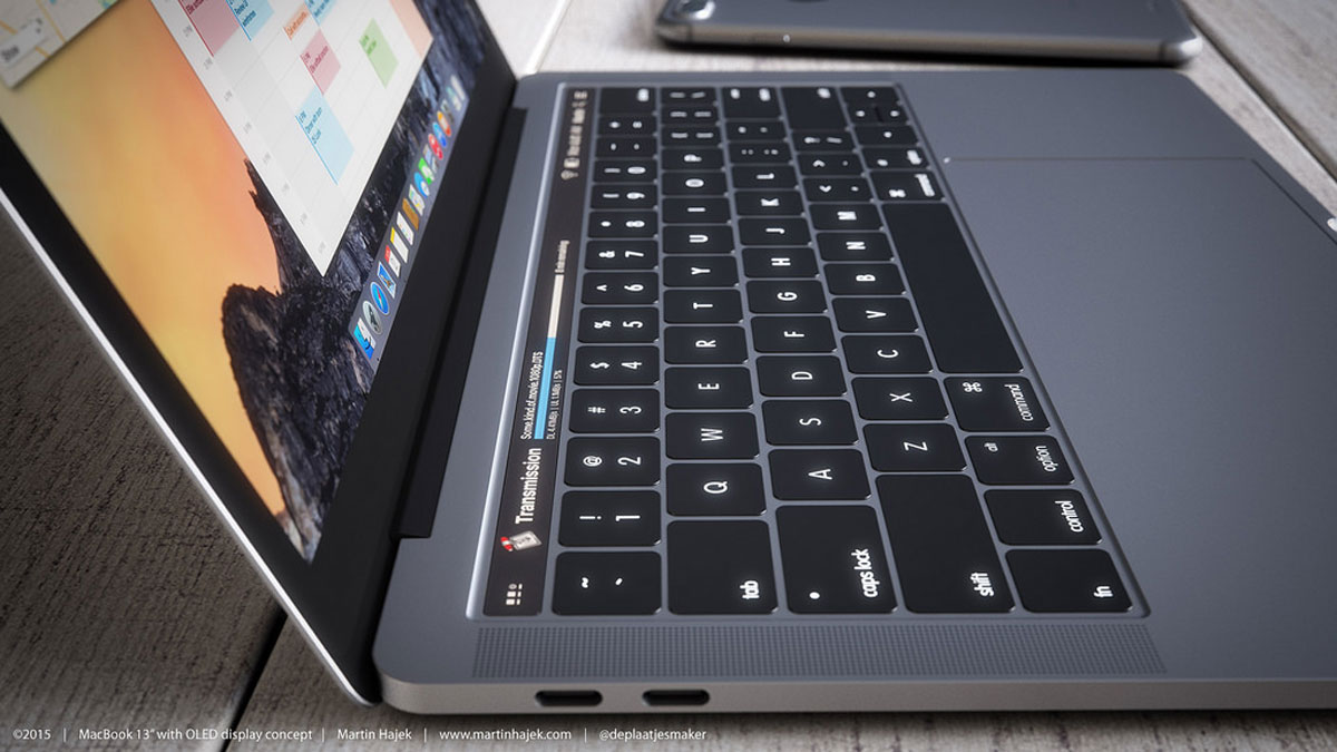
And then, of course, there’s the Touch Bar. Far and away the most compelling addition to the system, the skinny touchscreen Retina display offers a new input paradigm. It’s a way for the company to continue to avoid the Windows 10 route, eschewing full touchscreen functionality while still offering the ability for users to touch-poke a swipe at a proxy.
It’s a sort of halfway point between a touchpad and touchscreen that lets Apple have its cake and eat it too. It also opens up the system to some compelling new workflow and computing possibilities as more parties develop for the feature.
After four years without a fundamental refresh, Apple has returned with a system that builds up some of the system’s strongest selling points, while introducing some tricks, and a few pain points along the way.
Down to size
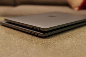
The MacBook Pro has been a lot of things to a lot of people over the years, but the word “sleek” has never really applied. That was never really the point. The MacBook Pro has always been about being a powerhouse. It’s right there in the name, a product targeted toward the company’s base of creative professionals looking for something more portable than a desktop. Of course, that appeal has spilled over into other users simply looking for something with a little more under the hood than an Air.
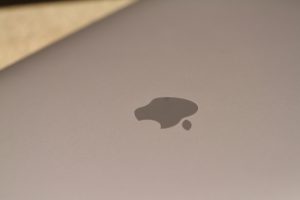
The latest upgrade maintains much of the design language of its predecessor, while taking a few cues from the standard MacBook, with smoothed out lines and even fewer parts making up its unibody exterior. That long black plastic strip on the rear of the computer is gone. So too, interestingly, is the iconic glowing Apple on the lid, replaced, for better or worse, with a mirror version.
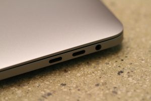
At 14.9 mm, the 13-inch version is 17 percent thinner than its predecessor. The 15-inch version is down 14 percent from the previous version, at 15.5 mm. The system volume is noticeably streamlined as well, down 23 and 20 percent, respectively, along with a half-pound weight drop for both laptops, down to three and four pounds apiece. It’s not exactly night and day — and the 15-inch version will still feel pretty massive for those who have been carrying around an Air for all this time, but as someone who’s schlepped the previous system around for hundreds of miles on convention center floors, it’s undoubtedly an upgrade.
And the build quality here is undeniable. The new MacBook Pro is a beautifully designed piece of machinery, enhanced by the edition of the MacBook’s Space Gray coloring, a dark, almost gun-metal shading that plays well into the overall sleekness of the machine. The more traditional silver coloring has survived the upgrade, as well, so if you’re partial to a light shade, you can tick off that option during the check-out process.
About those ports
Asked about the end of the SD slot, an outspoken Apple VP told The Independent that it was “bit of a cumbersome slot,” referring not to the port so much in its inert form so much as how the whole thing looks with a card sticking out its side. I’ll confess that I’ve come pretty close on numerous occasions to accidentally snapping a card in half after forgetting that I’d left it in the computer, but the word cumbersome never crossed my mind.
And as plenty of tech pundits have been more than happy to point out, an adapter is a heck of a lot more cumbersome than half of an SD card. It’s a strange sort of calculus, one that seems to point to a company more focused on the beauty of its hardware in a stationary position, recalling shades of the iPhone 7’s headphone jack adapter and the MacBook Air’s standalone optical drive. And perhaps more to the point, it marks the end of a feature that spoke directly to photographers and videographers who have been longtime devotees to Apple’s hardware.
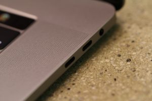
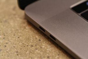
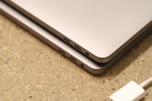
The loss of the SD slot is likely to have less of a direct impact on more mainstream consumers, but the impact of the move to four uniform USB-C/Thunderbolt 3 ports will be felt almost immediately. For Apple, the update marks a bold step into a future in which USB-C makes up the majority of peripherals. And we’re no doubt moving in that direction. Meantime, adapters. And no, they don’t ship with the system. For early adopters, these sorts of moves can feel as much like a loyalty pledge as a feature set.
For its part, Apple was quick to respond to feedback, issuing a pre-cut across the line, dropping prices by $20 in many instances. That does, however, still mean $49 for a multi-port adapter, and if you want to, say, charge your iPhone, you’re going to want to pick up a $19 USB-C to Lightning cable.
The beloved MagSafe adapter that the company championed a few years back as a way of ensuring that the whole system didn’t come crashing down if you ever tripped over the wire — that’s gone, as well. In its place is a long USB-C charging cable that plugs directly into a big, square power adapter that’s roughly the size of the existing Pro’s power brick. The good news on that front is that if anything happens to the cord, you can just replace it, rather than having to go out and re-buy the whole deal. The cables themselves are $20 and the adapter is $50, though, so if you, say, leave the whole thing behind at an airport, it will cost you roughly the same as the older system’s full adapter to replace.
The other nice thing about the upgrade is that any one of the system’s four Thunderbolt ports (two on either side) can be used to charge the system, a fact I’ve already found comes in handy, rather than having to contort around the cord when the closest power outlet is on the wrong side. Unfortunately, however, the new charging cable doesn’t have the handy red/green light as on older models to let you know that the battery is getting a refill when the system’s lid is closed.
Though, as with the MagSafe — and all USB-C ports for that matter — it’s reversible, so you’ll spend less time fiddling to plug it in. Though, given how much smaller the Thunderbolt are than full-size USB, it is a bit more difficult to plug a cord in without looking.
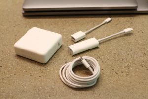
Aside from future-proofing, the other clear upside of the Thunderbolt 3 onslaught is targeted directly at professionals. The cables send a lot of stuff through, with data speeds of 40 Gbps (twice the speed of Thunderbolt 2 and four times USB 3.1) and the ability to support video, data and power all through a single cable. That means, among other things, that you can plug in two of those big, beautiful 5K monitors at once, a boon for video editors looking to use the Pro as the base of an editing station, but probably a bit less useful for the rest of us.
Oh, and there’s a place to stick those headphones in, as well, thankfully. It’s hard to imagine Apple having pulled a similar move to the iPhone 7 without some major pushback from musicians and video editors, who spend a lot of time in a pair of cans.
The bar is open
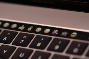
Everyone I’ve spoken with who has interacted with the Touch Bar thus far has walked away impressed. It’s a hard thing to translate, even with all of the flash and bang at the big unveiling a few weeks back. Partly because it’s hard to translate how nice and responsive it is and partly because it’s a bit hard to contextualize the role it plays in the computing process. Above all, the Touch Bar is adaptive, constantly changing, not only based on what applications you’re using, but how you’re using them.
The Touch Bar is actually one of the more innovative features to come out of Cupertino in recent memory. It continues the company’s recent history of blurring the lines between its mobile and desktop offerings, while not going so far as actually implementing the sort of touchscreen that have become standard on Windows 10 devices. The bar is thin, black and glossy, sitting directly above the keyboard in the bit of real estate traditionally reserved for the row of function keys. “This is crazy,” Philip Schiller told the audience as the new Pro made its debut, “keeping 45-year-old technology around and mapping other things to them.”
The real estate means there isn’t room for much more than tapping and swiping horizontally, though multi-touch means you’ll be able to use as many as 10 fingers at the same time. And while the interactivity lacks the directness of a touchscreen, interacting with the surface on a flat surface feels more natural to a veteran laptop user than reaching out and touching the screen. It also means less time spent wiping fingerprint grease off the display.
With the system is turned off, it’s just a long, thin black surface, broken on the far right by a small square that doubles as both the power button and a Touch ID fingerprint reader powered by a T1 chip. The feature has been added to the computer’s set up in a manner similar to what you walk through on any standard smartphone setup. Once you’ve opted in, you add a fingerprint by repeatedly placing your finger on the surface, shifting around the different bits to make sure it captures the whole thing. And like a smartphone, you can enter multiple fingerprints, though one is probably plenty.
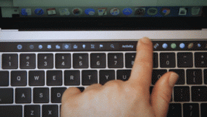
Once set up, the Touch ID can be used to wake the computer from sleep, purchase media through iTunes and buy stuff with Apple Pay. It was really only a matter of time before the company integrated that manner of biometric security into their laptops, and they’ve managed to do it in a sufficiently Apple way, hiding it away alongside the Touch Bar up top, undetected and out of the way until you need it. It’s a handy new feature — and arguably the new MacBook’s most underrated, doing its job in snap.
By default, the Touch Bar is mostly empty. With just the Finder open, the only buttons you’ll see are, let to right, Escape, Brightness, Volume, Mute and Siri. Tapping on Brightness or Volume will pop up a slider, so you can adjust accordingly. The adjustments are more precise and elegant than with the physical buttons, though accessing the slider does require an additional touch, potentially adding an extra step to the process.
The Finder bar also includes an arrow button, which, when pressed, brings up a much broader offering, including keyboard brightness, Launchpad, Mission Control and music playback buttons — the latter of which I miss having front and center regardless of applications, as they were when they were still a part of the physical keyboard. Music playback, while not yet present on third-party apps like Spotify, does still work with the media, as it does on older systems — you just won’t automatically see those options pop up when you log in.
You can customize your favorites in the Finder by clicking through the View menu. That pops up a translucent screen with options for filling up that no-man’s land that shows up in the Finder Touch Bar by default. This is actually the only place at present where you can drag things directly from the screen onto the Touch Bar, and it’s a really cool effect. Hopefully Apple or third-party developers will come up with more uses for that moving forward. It’s neat.
The real functionality, however, kicks in when you click into an app.
Raising the bar
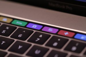
Let’s start simply, with word processing. The functionality will be coming to Microsoft’s offerings, but for the sake of brevity (and because it’s what I’m using to write this), we’re going to have a look at Pages. Start a blank document and you’ll see a button labeled Body. That’s for formatting. Tap it and a slew of options pop up, including headers, footers, caption, title and subtitle. Start typing and you’ll see a phenomenon similar to the kind you’re familiar with on a smartphone, popping up suggestions based on the your typing.
It’s a strange feature, really, given the presence of a full-size keyboard. That manner of predictive text was designed primarily to make up for the shortcomings of thumb typing on a small smartphone touchscreen. As a reasonably quick QWERTY typer, I can’t really imagine incorporating it into my workflow, as keeping an eye on that secondary display and tapping the word before I’m finished takes longer than simply typing the word. But perhaps it will hold some value for those a little less practiced at typing — or younger users who first honed their typing skills on a touchscreen.
The time-savings are clearer when you highlight a word. From there, you get further text formatting options, like bolding, italicizing, underlining, aligning, bullet points and color. Tap that and you get five different color options. Holding down on any lets you adjust the shade. There’s also a rainbow option on the right, which lets you chose from a wide array of colors through a slider. There’s no function there that you won’t already find in the format bar on the existing app, but what the Touch Bar does is bring that functionality front and center, where your fingers already are.
And then, of course, there are emoji — the new language currency that had, up til now, largely been the realm of mobile devices. Those are front and center when using Messages on the desktop. Click into the app and you have a similar setup as the one you’ll find in Pages, with the addition of a little monochrome smiley face. Tap that and the Touch Bar lights up.
Here you get one of the best uses of the brightly colored Retina display functionality that is often hidden behind a wall of black and white. Your frequently used emoji populate the row, and you can move through them briskly with a swipe. The emoji are big, bright and colorful, and like it or not, they’re now a major player in the desktop MacOS ecosystem. In fact, they’ll also pop up as you’re writing, even in an app like Pages.
Type, say, “happy,” and a trio of happy faces pop up. I do wish there were a way to disable specific functionality like that on an app by app basis, in much the way that the operating system gives users control over the touchpad — or perhaps a roll out of the Finder customization to different apps. I’d rather not have emoji pop up as I’m typing something serious in a word processor — or, for that matter, anything on a word processor at all, really, but they do come in handy for chat applications like Messages.
Safari brings some nice functionality to the Touch Bar. Fire up the browser, and you’ll see favicons for your favorite sites as determined by the app’s bookmarks bar. There are a bunch of big sites in there by default, and you can add your own, though, for some reason those don’t appear as full-size icons as you see with the TechCrunch logo above. The Touch Bar also doubles as a search bar and features thumbnails of the different tabs you have open, allowing you to browse through them with a swipe.
Unfortunately, the Safari interaction is limited to the browser, rather than adjusting based on the sites you’re visiting.
The bar also comes in handy when you get a call. You can pick up, hang up, mute and switch to video. It also displays the number and an image of the person calling, along with the amount of time you’ve been on. Calendar functionality is solid, making quick work of scrolling through dates.
At present, the best implementations of the bar, unsurprisingly, involve media. In apps like iTunes, Garage Band and Final Cut (iMovie’s current feature set is sadly limited), the Touch Bar is great for scrubbing through songs and videos. If you’re, say, an editor, playing back video for someone, it’s a great way to take them through shots. It’s also a quick way to flip through images in Photos. They’re small, but surprisingly clear, thanks to the Touch Bar’s 2170 × 60 resolution, but it’s still a extremely limited strip of vertical real estate, so the images are extremely small — most full realized in the form of emojis.
There’s a lot to like about the Touch Bar, and Apple’s clearly just getting started. In cases like media, it really feels like second nature, providing a natural new way of interacting with content. In other spots, one wonders if Apple was just trying to fill in the space in an attempt to get the most of the neat new feature, even where it doesn’t feel necessary. But like the iPhone before it, it’s easy to see how the feature could really take off after it’s fully opened to third parties.
A few will have Touch Bar functionality enabled at or around launch, including some big names like Microsoft and Adobe, who will be offering it up for Office and Photoshop, respectively. I’m also pretty excited to try out djay Pro, which will be arriving later this month, letting users scratch digital records with a swipe. In the meantime, the company has opened an instructional page, along with a software development kit for those looking to add functionality to their apps. Once submitted, they will likely be subject to a similar vetting process as the Apple implements in its App Stores.
The Touch Bar will also take some getting used to on the part of the user. Aside from certain functionality like volume and brightness, which have traditionally been built into the function row, you have to remind yourself that the tool is at your disposal. Much like 3D Touch on the phone, you need to train to make it apart of your workflow.
Most users will find it a welcome addition to the Pro’s offerings, but aside, perhaps, from media playback, I’m not sure there’s anything here yet that I would deem a “killer app.”
Old-school input
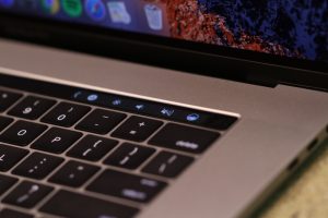
Thankfully, the addition of the Touch Bar doesn’t mean that any of the other input methods are going away. Not for now, at least. I’ve tried typing on flat surfaces with devices like Lenovo’s compelling — but flawed — Yoga Book. I get the sinking suspicion hardware manufacturers are slow nudging us in that direction, but thankfully, we’re not there yet.
In fact, the new Pro actually features some upgrades on those fronts. The keyboard utilizes the second generation of the butterfly switch technology the company rolled out on the MacBooks. The technology offers the promise of more stable typing versus more traditional scissor-style keys. In the case of the MacBook, it also meant more shallow and stiffer tactile feedback. I used the system for a while during my review of the 2016 version, but never got used to it.
This time out, things feel markedly better. There’s still a bit of a learning curve when you’re coming off of the 2012 version of the Pro, but it’s a lot easier to get used to. I’m something like 3,400 words into this review at present, and I can already feel myself adapting to the feel. After about a week or two of solid use, I think I’ll be fully on-board.
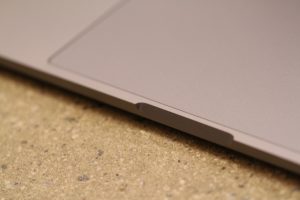
The TrackPad, meanwhile, is huge. It’s 1.5X the size of its predecessor, monopolizing a majority of the space in front of the keyboard. I’ve not encountered too many instances in my own day to day usage in which I found myself particularly grateful for the added real estate, but who’s going to argue with a little extra space. It could certainly come in handy for casual desktop gaming and the like.
The TrackPad carries over the same unfortunately named Glass Force Touch technology that you’ll find on the 2015 version of the laptop, trading a true mechanical click for a haptic one — or, rather, Taptic, in the Apple parlance. That means an update to the more traditional mechanical “diving board” version found on the 2012 version, which concentrates the clicks toward the bottom of the area, so the resulting click decreases as you move up toward the keyboard.
The company has done a good job refining the technology to the point that it seamlessly mimics the more traditional design. The technology means you can click anywhere on the surface with the same result, while Force Touch means that it responds differently to different levels of pressure. In the simplest example, a standard press selects an item, while a deep press opens it, saving you the double-click.
Sound and vision
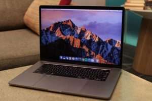
Apple’s maintained the same Retina display resolution as the 2015 versus, which is to say 2560 x 1600-pixel resolution on the 13-inch (or, 13.3, to be more precise), which works out to 227 pixels per inch and a 2880 x 1800 on the 15-inch (15.4, that is), which is 220 PPI. That’s also the same resolution you’ll find on the four-year-old 15-inch Retina display MacBook. Of course, some of the competition has managed to surpass that resolution in the intervening years, including, notably, Microsoft’s Surface Book, which the company is increasingly using to target creative professions, thanks in part to the upcoming arrival of Windows 10 Creators Update — that 13.5-inch convertible laptop sports a 3000 x 2000 resolution at 267 PPI.
Still, the MacBook’s screen remains lovely, and, for most users, it’s more than enough, particularly when coupled with increased brightness (up to 500 nits from 310 in the 2015 model), wider color support and an increased contrast ratio. Pictures and video look great on the laptop. The colors are more vibrant and the blacks are deeper than the 2012 version I’ve been staring at lo all these years — a change that’s apparent the moment you fire up the system and are greeted with the glowing sunset orange on the snowy Sierra Nevada mountain range that populates the default MacOS wallpaper.
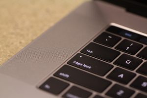
Interestingly, the speakers are getting a lot more fanfare in Apple’s own press material, echoing its moves around the iPhone 7. And frankly, it’s nice to see. Too often hardware makers overlook system audio for other features, assuming most users are plugging in a pair of headphones or syncing up to a Bluetooth speaker. There’s probably something to that, but if I’m paying $1,799+ for a laptop, I want a decent pair of speakers, damn it.
The speaker grilles are positioned the same way they have been on previous systems, flanking the keyboard on either side, though the perforated surface takes up a bit more space this time around, encroaching ever closer to the QWERTY and edge of the system. The speakers also take advantage of the vents on the bottom of the laptop as a sort of mini-woofer, emitting the low-end for a fuller sound — 2.5X louder bass, according to Apple. And everything’s louder for that matter. The new MacBook Pro can really crank.
I wouldn’t recommend swiping the volume slider too far to the right, however. The system loses some clarity when it gets too loud. Still, the speakers offer a notable upgrade over their predecessors and do a good job for casual music listening or movie watching in bed. If you’re looking to edit some pro audio or video, or the other hand, you’re going to want to invest in a quality set of cans.
Under the hood
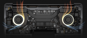
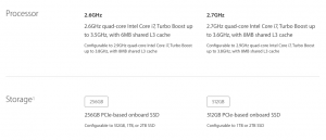
There is, as you’d expect, a lot of processing power at your disposal here. On the 13-inch with Touch Bar (let’s just go ahead and pretend like the other one doesn’t exist for the moment, shall we?), you get a dual-core Intel Core i5 at 2.9GHz with 8GB or RAM and 256GB of storage as a base. The 15-inch, meanwhile, starts at 2.6GHz quad-core Intel Core i7 and Radeon Pro 450 graphics, coupled with 16GB of memory and 256GB of storage. Of course, all of that is upgradable — and all of those upgrades are going to cost you.
Apple sent along the base-level version of the 15-inch system, and it handled everything with aplomb, including some basic editing tasks using the latest version of Final Cut Pro. Of course, if you’re planning to do some truly complex video stuff, you’re going to want to bump up those specs. The next level up gets you the 2.7GHz version of the Core i7, 512GB of storage and Radeon Pro 455 graphics — all for a $400 increase.
And if you really want to go for it, you can bump the processor up to 2.9GHz, make the graphics Radion Pro 460 and push the solid state storage all the way up to a hearty 2TB. Just for fun, I specked out the laptop on Apple’s site to see how much it would cost to get the latest and truly greatest. It’s… drumroll please… $4,299. At the end of the day, all of those adapters are chump change, really.
According to the company’s in-house battery rundown tests, both the 13- and 15-inch models should give you around 10 hours of battery life, which is more or less the same as what was promised with the 2015 models. Performing a battery rundown test on the 13-inch Touch Bar model, I didn’t quite hit the mark, instead coming in at around nine hours and 35 minutes. Close, but not quite there.
Still, more than enough to get you through a long flight, which is a heck of a lot more than my current MacBook can say. All that in spite of the addition of a much brighter display and the Touch Bar, the latter of which doesn’t seem to have much of a discernible impact on longevity.
Going Pro
The less celebrated spec bumps are what make the new Pro a worthy upgrade, particularly for those who, like me, have been suffering through their old system’s death rattles (or fan buzzing, at least), waiting for a significant update from the company. Better processors, more storage, a brighter display and better speakers are all wrapped up in a sleeker and lighter package than before.
The Touch Bar feels like a nice bonus for the time being. It’s a compelling new input device that has the potential to alter the way we interact with applications on a laptop. In this early stage, it’s a cool feature that further distinguishes the Pro from other similarly spec-ed laptops, proving most useful in the consumption and creation of media like video, audio and images — all part of the creative professional demographic that has long served as one of the company’s core user bases. As Apple and third-party developers continue to play around with the form, its usefulness will only continue to grow. And perhaps it won’t be too long before we start seeing desktop applications built with the Touch Bar in mind, rather than adding such functionality in hindsight. The addition of Touch ID, however, has some immediately welcome functionality, including more secure startups and purchasing.
The move toward all Thunderbolt 3 ports will no doubt prove a pain point for many users. Apple’s gone a little ways toward lessening hurt by dropping prices on adapters, but along with the added expense, it’s tough to ignore the irony of plugging in various sorts of dongles in the name of elegance. And as someone who shoots a lot of photos for his work, I’m going to miss you most of all, little SD card slot.
And, as ever, the new MacBook Pro doesn’t come cheap, with a starting price of $1,799 (for the 13-inch Touch Bar version) all the way up through the fully packed model that goes well north of $4K. But let’s be honest, users have never bought Macs because of their rock-bottom prices.
For those who have been holding out on buying a new MacBook, the time is right, with an upgrade that should be sufficiently future-proof to take on the next few years — or however long it takes for the next major upgrade. Hopefully you’ve been saving up in the meantime.





Leave a comment